Role in the project: UX/UI Designer
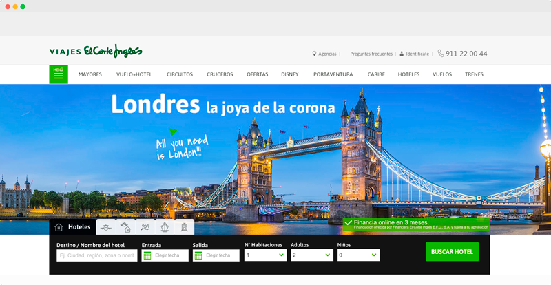
I worked for the technology consulting firm atSistemas, both remotely and on-site with the client, on the design and implementation of the new Viajes El Corte Inglés website.
I worked for the technology consulting firm atSistemas, both remotely and on-site with the client, on the design and implementation of the new Viajes El Corte Inglés website.
The main goals were to increase e-commerce sales, improve the visual design and mobile user experience, enhance landing page performance, and highlight the value of the travel products on sale.

I began by conducting usability studies on the existing landing pages, reviewing whether they aligned with Nielsen's usability principles and whether interactive elements such as CTAs and links followed a clear hierarchy. A key part of this phase was checking whether the information architecture and funnel flows were working effectively for users.
I also gathered analytics data to establish a baseline and evaluate whether future improvements were moving in the right direction. Using Google Data Studio, I monitored traffic, navigation toward the main funnels, bounce rates, and other core metrics on a daily basis.
Through Hotjar, I reviewed user recordings and observed behavior patterns directly. This helped me understand the main problems users were facing in the e-commerce experience and build a stronger sense of empathy around their needs.

Design issues: the original landing page system was based on rigid rules with very little flexibility. Its grid structure limited the ability of teams to add value to their products or present differentiating content effectively. At the same time, the Oracle CMS came with restrictions that prevented us from taking full advantage of its capabilities.
Imagery was another major challenge. Managing image sizes and formats in a large travel e-commerce platform required a careful balance between flexibility and production effort. I needed to define new image approaches that would support the product better without creating unnecessary complexity for the visual creativity team. Because this was a travel site, the imagery also had to inspire users, not just fill space.
At a broader level, one of the main issues was the lack of clear categorization in how products were presented. Users had limited control over the information they were browsing, which affected both clarity and decision-making.
I then carried out an in-depth benchmarking process to understand the competitive landscape: who the key players were, how they solved similar problems, and which patterns were common in the sector. This gave us a stronger basis for defining our own solutions.
To build a more effective information architecture, I held working sessions with each Product Owner and their teams. Their input was essential because they knew the products in depth. Together, we defined a clearer information hierarchy aligned with user needs and business value.
I also worked closely with different technical teams, including creatives, layout designers, CMS specialists, and developers. These sessions helped us understand the system's limitations and identify improvements that were realistic in the short and medium term.
Summary: the main problems to solve were how to inspire the desire to travel, give teams more freedom to create content, improve performance, streamline CMS contribution, and make implementation easier for development teams.
This phase focused on organizing the insights gathered so far and turning them into new design ideas.
At this stage, teamwork became more important than ever. We shared proposals, ran co-creation sessions, and gathered as many useful perspectives as possible to guide the design process, always keeping data and user needs at the center.
Brainstorming gave us the freedom to explore solutions before technical constraints narrowed the path. We were looking for the most effective and intuitive way to improve the relationship between users and the system.
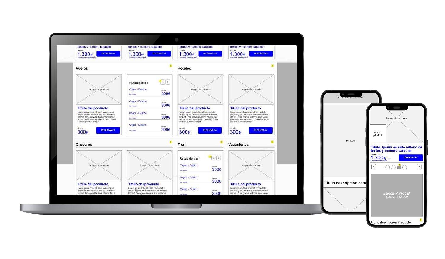
With the information gathered and structured, I moved into the wireframing process. The main tool at this stage was Axure Cloud, which allowed me not only to create wireframes but also to produce detailed documentation for components and interactions. Using Axure, I defined the different responsive views, the behavior of each module, and how users would interact with the landing pages across devices.

I created new modules that addressed the needs of the different departments. Once the wireframes were ready, we presented and tested the proposed solutions with the relevant teams and with real users. After validation from the technical teams, the visual design phase began.
Design decisions were made by combining team input with the evidence provided by analytics tools and user behavior data.
During the visual design phase, I mainly used Sketch and created symbol libraries to maintain consistency across the system. For version control, I used Abstract, which gave the team a reliable workflow for managing changes and working securely in the cloud.
Once the designs and interactions were validated again, the solutions were implemented in close collaboration with the development teams.
Once the new solutions went live, ongoing analytics monitoring became essential. It allowed us to validate performance in production, understand how users interacted with the new modules, and continue improving the experience over time.
The analytics showed significantly better results, higher interaction with key elements, and an improvement in sales.